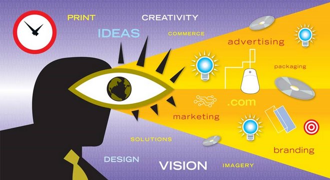
Advertising Considerations
Shaffer Design Works, LLC excels in providing it's client base with a variety of marketing vehicles. Rick Shaffer, Principal and Creative Director, says, "With the economy tightening up, Shaffer Design is experiencing a number of our clients requesting more traditional tactical approaches to advertising, that said we have been required to produce some creative and innovative advertising for these folks."
A successful campaign involves many aspects but also follows proven paths. Consider the fact that running more than one print display ad or a combination of print and online can dramatically increase response. For example:
• Your subhead should sum up your business benefit to customers, possibly including a special offer or a unique aspect of your business the others can't match.
• Online advertising is proven that give ready to buy customers exactly what they need to make a purchase decision.
• Online directory usage is growing to highlight your business and show a solution, not a problem.
• A combination of print and online to enhance the customer experience like an emergency phone number, pager or Web address or e-mail. Be sure to list all of your locations and phone numbers.
• A listing in local search engines to reach a broader range of potential customers and leverage similar or overlapping headings, e.g., a florist with ads under “Weddings” and “Corporate Events” and “Funerals.”
• Running two display ads to target prospective customers in nearby areas or in Specialty Guides to reach specific audiences, e.g., “Aviation” or “Medical”. What's more, Companion directories have been shown to deliver twice the ROI of main directories when added to the mix.
• Customers rank multiple locations to stand out from competitors and to provide enough information for a customer to make a purchase decision on the spot. Research proves that doubling the size of your display ad yields a 45% increase in phone calls.
Contact Shaffer Design Works today to experience the ROI for your advertising dollars. With our no how and expertise we can make your company stand out above the rest. Visit: http://www.shafferdesign.com/
Thursday, October 16, 2008
Wednesday, July 02, 2008
2008 Northeast Ohio Event Planners Expo
Shaffer Design Works has the unique ability to execute on all creative marketing and brand applications when it comes to your company's next creative event.
Friday, June 06, 2008
Another Successful Website Project for Shaffer Design Works
Recently Shaffer Design Works completed a Website design and development project for a company called C2 Cups. The company specializes in making and distributing cups and lids of all shapes and sizes. Rick Shaffer, Principal and Creative Director says, "The team at Shaffer Design Works played an integral part in Website design and programming the C2 Cups Website and is proud to serve the folks at C2 Cups."

To experience the Website in all its glory visit: http://www.c2cups.com/index.html
Shaffer Design Works specializes in strategic marketing, exceptional graphic design or any marketing or advertising that requires great ideas. Contact Shaffer Design Works today at: http://www.shafferdesign.com/
Monday, April 07, 2008
Website Design and Search Engine Optimization go hand in hand
Creative design boutique Shaffer Design Works located in Streetsboro near Cleveland and Akron, Ohio recently completed a large scale website project that included search engine optimization. Rick Shaffer, Principal and Creative Director of the creative agency Shaffer Design Works says,"The people we employ at our creative offices are more than just design centric individuals they are great thinkers too. We accomplish both large scale Website designs and advertising projects by knowing more than just the latest color trends and typography. You need to be able to put yourself in the clients shoes and sometimes more importantly the clients customer base as well as their potential prospect bases. We are able to do this by successfully communicating with our customers while helping them approach different strategies when it comes to their advertising and marketing vehicles."
One of Shaffer Design Works long standing customers is INEX. With their roots heavily entrenched throughout the aviation community, INEX specializes in aircraft detailing for aircraft both large and small. INEX has service locations throughout Florida, Ohio, Texas and a growing amount of basis on the west coast. While maintaining this national presence, INEX excels at delivering great customer service. Shaffer Design Works has implemented a plan that looks to boots traffic to: http://www.inexaircraft.com/ in the coming months of 2008.
Our design and internet capabilities are second to none. To learn more about Shaffer Design Works providing graphic design to your organizations advertising and marketing mediums across the board, visit: http://www.shafferdesign.com/
Thursday, April 03, 2008
Fashion Photography and Graphic Design
Advertising and marketing specialist with creative direction experience Rick Shaffer of Shaffer Design Works has just finished completing an advertising assignment for a small clothing boutique located in Beechwood, Ohio. Rick Shaffer states,"Executing great design work for every marketing and advertising platform is what Shaffer Design Works is all about. Shaffer Design relishes in the opportunity to exceed our clients marketing expectations and because of our hard working mentality we maintain a loyal long standing client base of diverse and unique customers.

Above is a recent print ad sample that be appearing in the publication Currents: http://www.currentsnews.com/
For creative and promising advertising design contact Shaffer Design Works located in Streetsboro, Ohio near Cleveland and Akron, Ohio. See: http://www.shafferdesign.com/
Sunday, March 23, 2008
Tradeshow Exhibit Design and Graphics
Cleveland graphic designer and marketing expert, Rick Shaffer helps an array of customers with their marketing initiatives. Tradeshow planning, marketing and design is an area that Shaffer Design Works excels in and always produces exceptional advertising vehicles, regardless of the customers demands. To help with planning and execution of your next tradeshow I have outlined a few tips below.
Tradeshow Tips:
– When planning and researching a tradeshow, be sure you can gain or have a chance at gaining at least enough customers to make the event worth while.
– Be sure to have enough business cards printed before hand to handout. This may seem trivial to some people, however you would be surprised at the number of professionals who run out of business cards during or before an event commences.
– When producing tradeshow literature and collateral, be sure to keep it simple and eye catching. Professionals that often visit a show often don't read the literature that is handed out right away, this is why it is increasing important that your literature deliver a quick, clear and concise message to any potential prospect that may visit your organizations display booth.
– When managing or occupying a booth, don't underestimate the power of professional attire. The type of clothing you and your associates choose to wear when managing and attending a booth depicts how serious your organization is. So make sure you and your associates look the part.
Recently Shaffer Design Works, engaged in a project to assist with producing a tradeshow backdrop. An example of an 8' exhibit is shown below.

When considering your next trade event or if your company or organization is looking for great ideas when it comes to large or small tradeshow events and exhibits contact Shaffer Design Works at: http://www.shafferdesign.com/philosophy.php
Saturday, March 15, 2008
Identity Standards
Cleveland based graphic design firm specializing in Advertising, Internet and Marketing brand applications is assisting a large manufacturer with the authoring of an identity standards guide. Brand identity standards guides should include everything that touches the marketing and advertising platforms.
Below is an outline that provides a brief best practices approach to writing and developing a brand standards guide:
a.) Corporate Level applications: business card, (all) stationery applications as well as PowerPoint and Website brand attributes.
b.) Advertising guidelines (layout, font, colors, style)
c.) Signs (lobby signs as well facility signs (also known as environmental graphics) at a corporate and retail level, Point of Purchase should be included in this section as well (however applicable).
d.) A standards manual should also contain catalogs, (print and electronic versions) manuals and any internal document layouts (before and after – if there was recent rewrite, this can help ensure workforce notification and participation).
Finally it is important to have key personnel within the general marketing department help follow-up and be available to answer any questions about brand guidelines. This will help see through continued execution of a re-brand or updated corporate identity standards manual.
Obviously the points above have been summarized and entire pages can be written about each section and subject. However, it is important to remain focused on driving consistency and uniform brand guidelines where applicable within a company or organization.
Shaffer Design Works brings a wealth of knowledge and experience in this category to all of our branding and re-branding projects we engage in. For more information about brand guidelines and standards contact: http://www.shafferdesign.com/
Thursday, February 28, 2008
Invitations Come in All Shapes and Sizes
Invitation design is usually something that is thought of as a smaller design application. Recently, Shaffer Design Works Cleveland design firm offering creative services for advertising and marketing applications was asked to create a fairly large invitation for an upcoming corporate event held in Baltimore, Maryland.
There were a few reasons for the large format chosen to house the invitation:
1.) Easy recognition via US Mail
2.) Quantity of information that needed to appear within the layout
3.) Multiple options for response (i.e. Phone, Email and Direct Response US Postal Service perforated card)


Some of the challenges we face at Shaffer Design Works range from time sensitivity to finessing the amount of content a finished piece requires. We always find creative ways to accommodate our customers.
The large direct mail/invitation was a success and was met with high praise.
For more great ideas in creative marketing see: http://www.shafferdesign.com/
Wednesday, February 20, 2008
Color
Familiarity with color psychology, use and theory helps achieve a total color effect. Shaffer Design Works retains experts on the subject of color theory and specification. The psychological effects of color on people has always been a heavily debated subject, color is no different than any other subjective subject. I have outlined a some basic color reference tips below:

Light and Cool Colors Recede
Light and cool colors can make a space seem bigger.
Dark and Warm Colors Advance
Dark and warm colors can be used in large rooms to keep the space from feeling vast.
Bold, Primary Colors = Speed
Appropriate for encouraging fast food turnover and children's areas.
Subtle Colors are Restful
Pastels can make a room feel bigger and often have a calming, peaceful effect.
Color Can Convey a Theme or Style
Green for nature, pastels for Post – Modernism, red, black & white or gray & pink combinations for a 1950's look.
Colors Should Relate to Climate
Warm colors feel right in colder climates cool colors feel right in warmer climates.
Consider the feelings colors can convey and what colors can do and say
Think about the feelings colors convey and what colors can do and say.
RED
Red suggests aggression, hostility, heat, stop, error, warning, danger, error, fire, lushness and passion. Red & black is a classic combination. Some say red enhances the appetite.
GREEN
Associated with nature the pastoral and general well-being. Green also suggests envy and jealousy. Green should not be overused. Too much can affect skin tones and the appearance of some foods.
YELLOW
Yellow suggests the sun, expansiveness, happiness and high spirits. Yellow commands attention and suggests caution. It can be used successfully as a highlight color.
BLUE
Blue suggests the peaceful, the sad and water. Blue is often associated with the male.
Blue is a cool color and can visually expand a room. It does not compliment most foods. Blue goes well with warm colors and materials.
BLACK
Black can have negative sociological connotations like evil, mourning, ghostly, night, death and fear. However, black can be very stylish and and modern. Black works well as an accent with other colors.
WHITE
White suggests the virginal, the innocent, the cold and the clean.
White walls can encourage turnover and are in keeping with the bright, clean atmosphere of a fast food environment. Too much white can contribute to glare.
NEUTRALS
Dark browns suggest masculinity, lighter browns warmth and femininity. A neutral background allows for flexibility.
When developing marketing materials, Websites, and/or just picking a new color for the walls in your living room take the above guidelines into consideration. Remember the subject of color can be very subjective. For questions about color selection or just how to achieve a better color advantage over your customers contact Cleveland creative services firm Shaffer Design Works at: http://www.shafferdesign.com/
Logo Design Process
This blog entry is for anyone who might be involved in the process of purchasing creative services from any type of creative agency, graphic design house, Web house, marketing firm or design studio. I have taken the time roughly outline a basic logo creation and design from concept to final approved art for the corporate identity and corporate identity standards manual stages.
The first part (Creative Process #1) of this process begins with conceptual ideas about the logo and what the logo will ultimately stand for or symbolize. In the example below, the logo was for an individual that was starting a company comprised of several advisory and/or networking boards. The design concept that was pursued was an idea that helped to depict a group (RPF) surrounded by the G (Group) to help demonstrate a closeness that would be experienced in an advisory board environment.
The creative design folks at Shaffer Design Works begin (Creative Process #2) formulating their ideas around their discoveries from Creative Process #1 with black and white layouts. An artist will begin selecting typography or a type face for what will be deemed appropriate for our client's general audience. We begin with rough thumbnail sketches and/or B&W layouts to help us develop the general form of the logo or company symbol. In the example below we showcase a type ligature to help demonstrate the idea.

Once a few designs are completed (one shown here) we then take the creation into the color selection process (Creative Process #3). In the example provided below, the customer requested very vibrant color combinations. The client wanted their potential partners to get excited about conducting business with RPF Group thus the reason for the bright color suggestions. The leader of the company chose the first color option (shown below).

Final Approved Logo Design

For more great corporate identity and branding strategies contact world reknowned graphic design firm and creative design boutique at: http://www.shafferdesign.com/
Monday, February 18, 2008
Photography Retouching for the Fashion Industry
Expert Photo Retouching is a creative service that Shaffer Design Works has always offered to all industries (i.e. manufacturing, aviation, retail, human resources, construction, financial, medical ETC.). An example of photography retouching can be found below. These photos were shot on a Saturday and appeared in The Cleveland Plain Dealer the following Wednesday. While all of the photo retouching that Shaffer Design Works creatively executes for various advertising mediums is expertly color corrected the assignments sometimes come with tight deadlines. Shaffer Design prides itself on serving all of clients regardless of the deadline or ultimate goal of the marketing piece.
Speaking of last minute color correcting in Adobe Photoshop, The color correction specialists at the Shaffer Design Works studios in Streetsboro, Ohio worked there magic on removing a yellowish cast of light that was unavoidable when the photography was captured. By removing the yellowish cast the dress was brought back to its original true Lavender color. This photo alteration allowed the dress to showcase exceptionally well in the newspaper magazine advertisement.
Original Photography

Retouched Photography

Newspaper Ad Showcasing Retouched Fashion Photography

Contact Shaffer Design Works for exceptional photo retouching, creative advertising layouts and ideas. We also help out with the occasional copy writing assignment as well. Visit: http://www.shafferdesign.com/
Monday, February 11, 2008
Client Testimonial
Recently, I received a compliment from Sheila Miklos a colleague of mine. We have worked together on several projects and with several different kinds of customers and business types.
Recently, I designed, created and executed a string of print ads for the Cleveland newspaper "The Plain Dealer". These ads were directly related to a clothing boutique/store located in the Beechwood, Ohio area. Sheila was very happy with all of the services that Shaffer Design Works provided. Sheila's testimonial is written below.
Rick,
"Thanks for all of your good work, you are a pleasure to work with! Prompt, professional and insightful, I have come to rely on you for your creative input."
– Sheila Miklos
Foxcroft Consulting, LLC
Forest Stewardship Council's Chain-of-Custody Certification
Shaffer Design Works Cleveland/Akron advertising and marketing firm specializing in creative graphic design ideas for small to large businesses is proud to be associated with recipients of the Forest Stewardship Council Certification program. Recently our printer was authorized to use the "checkmark tree" logo on certain paper in order to assure our customers that the wood content of that material came from responsibly managed forests. Shaffer Design Works has always been a huge supporter of any organization that participates in the preservation or green movement activities. To learn more about the Forest Stewardship Council United States visit: http://fscus.org/
Rick Shaffer states,"We continue to evolve our thinking when it comes to producing marketing and advertising pieces for our clients. Following environmental trends and movements makes us proud and helps our customers tap into environmentally friendly methods of commerce. Whether the marketing challenge entails an online publication, logo design, branding project, newsletter publication or a printed brochure we are proud to offer the best solution lending itself to the green movement."
Before starting your next design, marketing or advertising project contact Shaffer Design Works with offices located in the Streetsboro, Ohio area, we have the creative solutions that you have been looking for. See: http://www.shafferdesign.com/services.php
Friday, February 08, 2008
Direct Mail for Advertising and Marketing
Below is a link to the United States Postal Service Website. This link has some useful tips on direct mail.
See: http://www.usps.com/directmail/research.htm
For great ideas in creative marketing and advertising visit:
http://www.shafferdesign.com/
Below is a link to the United States Postal Service Website. This link has some useful tips on direct mail.
See: http://www.usps.com/directmail/research.htm
For great ideas in creative marketing and advertising visit:
http://www.shafferdesign.com/
Wednesday, February 06, 2008
Swatch Booklets for a Large Cabinet Manufacturer
Shaffer Design Works in the Cleveland, Ohio area creates high-end marketing solutions for manufacturing companies and small start-up businesses. Rick Shaffer says, "Producing great work involves getting to know your customers business, personality and long-term goals. At Shaffer Design Works, we have a philosophy that includes a series of brief questions to assist in the marketing and creative success of our clients creative advertising objectives. This process also helps bring added benefit to our efficiency both on the production and budgetary sides of the business."
Below is an example of a series of swatch books that were designed by the team at Shaffer Design Works. One of the challenges with this project was the swatch books had to look cutting edge along with being able to withstand the elements of a typical construction site. This example demonstrates what the swatch booklets looked like before redesign and also demonstrates the approved layouts.
Cabinet Swatch Booklet Covers BEFORE


Cabinet Swatch Booklet Covers AFTER


Additional Cabinet Swatch Booklet Covers to Further Demonstrate Continuity and Brand Conformity
Birch Cabinet Swatch Book

Cherry Cabinet Swatch Book

Maple Cabinet Swatch Book

Oak Cabinet Swatch Book

For great service and marketing ideas contact Shaffer Design Works at: http://www.shafferdesign.com/services.php
For more information about Rick Shaffer, Principal and Creative Director at Shaffer Design Works visit: http://www.linkedin.com/profile?viewProfile=&key=9416953
Sunday, January 27, 2008
Corporate Identity Development
Graphic design firm located in Cleveland, Ohio develops logos and helps company's further define their corporate identity standards and specifications. When Shaffer Design Works develops a corporate identity for a business or large organization we always propose consideration for anything the logo and colors will touch or come in contact with. Examples of these items are everything from the obvious to the not so obvious like: business cards, stationery, lobby signage, exterior signs, PowerPoint presentations, Corporate website, internal web site, uniforms, media, print ads, electronic ads, capabilities brochures, catalogs, vehicle signs and/or anything else that might carry the company logo and equity colors.
Below is a recent logo that was developed for an IT/computer technology company. The two options were initially presented to the client. The staff at Schaffer Design Works has been known to present several options so the client is able to make the best possible selection for his or her organization. When SDW designers develop a logo they feel that it is important for the logo to have meaning and a direct correlation to the company's mission or core services. In the example below, Proneva's logo is depicting a mountain to help signify putting technology and service first or on top. The colors were chosen to help support the idea of cutting edge technology and computer services.

Contact Shaffer Design Works today to find how we might help with your next branding strategy. Visit: http://www.shafferdesign.com/
Wednesday, January 16, 2008
Brand Consistency between the world of print material and the world wide Web
Shaffer Design Works serves a multitude of clients from different business categories and markets, this helps keep our work and projects diversified. For example, one minute we are working on an e-mailable newsletter and the next we might be helping a large organization re-write their corporate identity standards manual. At any rate, good brand should compliment your business or organizations overall message, look and business type. Most importantly a well designed brand should be able to cross both print and internet advertising and marketing mediums along with staying consistent and true to the corporate colors the company brand employs.
An example of a recent re-brand that Shaffer Design Works has helped to implement is a newsletter for a procurement company specializing in saving their customers both time and money. Shaffer Design Works was tasked with redesigning the company newsletter along with the electronic version of the newsletter. This example demonstrates how a well thought out brand can bridge both traditional marketing mediums along with helping to stream line new, less expensive and exciting mediums.
Printed Newsletter Cover Layout

Printed Newsletter Inside Layout

Keeping in mind the newsletter and company brand attributes currently in place, Shaffer Design Works successfully developed a version for the internet and Email applications.
Electronic – Email Ready Newsletter Cover and Supporting Page Layout


Contact Shaffer Design Works at: http://www.shafferdesign.com/
Shaffer Design Works serves a multitude of clients from different business categories and markets, this helps keep our work and projects diversified. For example, one minute we are working on an e-mailable newsletter and the next we might be helping a large organization re-write their corporate identity standards manual. At any rate, good brand should compliment your business or organizations overall message, look and business type. Most importantly a well designed brand should be able to cross both print and internet advertising and marketing mediums along with staying consistent and true to the corporate colors the company brand employs.
An example of a recent re-brand that Shaffer Design Works has helped to implement is a newsletter for a procurement company specializing in saving their customers both time and money. Shaffer Design Works was tasked with redesigning the company newsletter along with the electronic version of the newsletter. This example demonstrates how a well thought out brand can bridge both traditional marketing mediums along with helping to stream line new, less expensive and exciting mediums.
Printed Newsletter Cover Layout
Printed Newsletter Inside Layout
Keeping in mind the newsletter and company brand attributes currently in place, Shaffer Design Works successfully developed a version for the internet and Email applications.
Electronic – Email Ready Newsletter Cover and Supporting Page Layout


Contact Shaffer Design Works at: http://www.shafferdesign.com/
Tuesday, January 08, 2008
Bring in the New Year with a Re-Brand
A food distributer and vending machine company engaged Shaffer Design Works as a guide for the company's new logo and corporate identity. Below is an example of the original business card and then the re-branded calling card showcasing the newly designed logo, style, colors and layout.
Original Business Card

New Logo and Creative Corporate Identity


When developing and laying out business cards for your company or organization it is important to consider using the backside of the business card as a marketing tool to help tell your corporation's story. An example of this creative process is demonstrated above with the National Fun Foods business card.
Shaffer Design Works is also helping National Fun Foods with various other brand attributes throughout their organization. When developing a brand, consider anything else that potential prospects and current customers might see that is connected to your business. For example, this vending machine company will have their new logo placed on coffee boxes, aprons for trade shows, invoices, delivery trucks, wending machine covers, signs and any other items to help solidify the new brand.
When introducing a new logo consider contacting local newspapers and magazines, as editors and reporters are always up for a new story. The is a great way to help bolster your PR campaign. Make a marketing splash when executing a creative re-brand, this can help your marketing investment bring in new business to assist in offsetting any marketing costs associated with your upgrade in branding.
For more great branding stories and ideas please contact Cleveland area design studio Shaffer Design Works at: http://www.shafferdesign.com/
Subscribe to:
Posts (Atom)